Thursday, September 29, 2011
Screen Pluck
Just as a side note - during the mid semester break I wrote this program ( in Java ) to aid in the development of my second life program. I anticipated that I would need to be taking timed screenshots, and didnt find any software which I really liked or that fulfilled the requirements I had.
So I wrote Screen Pluck.
It is free, and released under the GPL license.You can download it here:
http://sourceforge.net/projects/screenpluck/
So I wrote Screen Pluck.
It is free, and released under the GPL license.You can download it here:
http://sourceforge.net/projects/screenpluck/
Location
Here is a simple diagram showing the location as an augmented diagram with the second life building superimposed.
As can be seen, the southern end has pedestrian access is able to be utilised to draw the public into the exhibition space.
Reactive Lighting and Space Formation
In developing my idea of gifting within this reactive architecture head space I moved towards an idea of an architecture that develops the experience, shaping it around the 'user' of the architectural space. I developed a basic script using scratch for second life that has a timer which senses the distance to the nearest avatar and alters the light and glow affects according to the distance.
This was not entirely possible in scratch4sl so I had to learn Linden Script.
However, after a number of hours of learning and development I was able to create a successful script. The closer you get to the object the more it glows and lights up the surrounding area. The further you get from the object the less it glows and lights up.
The purpose of this correlates with the function of the architectural space. As the public walk through the high-traffic area that is over-arched by the southern section of the building they are then drawn into a semi-private space which is the exhibition area. This is a merging of both the private studio and the public walkway, but is true to being either strictly public, nor private. It's purpose is between the two, creating a thresh hold of space into which the pubic are drawn and the studio is present ( through their exhibited artworks ).
The public are drawn into this through the reactive element. As they walk through the covered section of the building which is public lights sense their proximity and light up around them, but draw them up the ramp through the visual narrative of the lights being long and continuing down the corridor in an unbroken geometry.
This exhibition space then needed to be shielded from overlighting in order to maximise the effect of the reactive architecture. This was achieved through creating a concrete wall on which to suspend the exhibitional elements.
Frosted glass texture
In order to address the issue concerning my 'box' being too intrusive it was suggested to me that I may profit from using a semi-transparent surface. I took this idea and developed it. The idea was to create a frosted glass surface that would only allow general shapes to be visible through the material. This would allow the public to see what is happening in the space, but would not interrupt or intrude on the privacy of the employees or partners. This concept became central to my design - the flow of space and the relationship between private and public space.
Below is the (tileable) frosted glass texture I developed in photoshop:
Below is the (tileable) frosted glass texture I developed in photoshop:
Wednesday, September 28, 2011
Reality Transfer
After learning how to create sculpt maps in 3ds Max, I then proceeded to move my original concept ( my final idea from teh drawing paper ) in to Second Life. It was rather difficult finding a site that resembled my location in reality - between two apartment complexes. However, I did find one that seemed to be perfect! So I began construction and completed my original form and structure.
However, this highlighted a number of issues in my design.
- The glass 'box' was too intrusive and may b uncomfortable for the workers and artists to have people watching them constantly.
- The thresh hold opening on both sides of the studio opened the studio up to the public excessively. There is a prominent lack of privacy.
- There is no exhibition space to engage the public - the glass wall ( which I had planned to have as the primary exhibition space - a membrane on which artwork can displayed ) was insufficient. It felt tacky.
This became the focus of my next work on the project.
Tuesday, September 20, 2011
Sculptie and Script idea
My sculpty is a waveform floor. It reacts with the user, so that when the user gets close it glows. The amount of glow is proportional to the distance the user is from the object. I had to learn the basics of second life in order to implement this ( scratch is rather limited in options you can implement ). Glow is not an option given in scratch so I used to scratch to create the basic framework and then I edited the code using the Linden Script API to edit the code myself. However, due to the lag of hte server the overall glow manipulation is difficult to observe unless you run it on a much less cluttered server.
The following are some screenshots of myself at work - some are on my own server in order to demonstrate the effects (geometry and script effect is identical on the Second Life Grid):
Above: Using the Secondlife grid and also using ScreenPluck - a program I wrote to take screenshots automatically while I work.
The following are some screenshots of myself at work - some are on my own server in order to demonstrate the effects (geometry and script effect is identical on the Second Life Grid):
Above: Using my own server to test out scripts and sculpties ( saving me a lot of bandwidth and time )
Above: Using the Secondlife grid and also using ScreenPluck - a program I wrote to take screenshots automatically while I work.
Second Life Scripting and Sculpties Issues
As we were asked to create some Secondlife Sculpties I created a strip that would duplicated to create my floor. However, I have run into some challenges with this.
First sculpties in Secondlife are physically treated as the type of object they are created from. So my floor is really an invisible block the size of a room. You cant walk on that. In order to overcome this I would have to create a number of invisible blocks to approximate the physical space of my sculptie.
Secondly, server overload. I am in the last group. Because of this the world is already full of prims and scripts. This is a significant problem for scripting. Why? Because Second Life uses server side scripting, NOT client side. So if there are a hundred or two hundred scripts running on the server then there will be considerable lag transporting this information back to the client side.
In order for me to work more efficiently I have installed and begun running my own local opensim server to test my scripts on. This way I can see if the scripts are working much quicker, and my workflow is much more effective.
First Sculpties
Judy asked us to create sculpties using 3dsMax. So I did. I downloaded and installed PrimCOmposer, and used software I wrote to take screenshots ( screen pluck - you cna find it on sourceforge ). I didnt find anything too difficult, except I couldnt remember how to recreate a sculptie in 3ds max. So after trying to figure this out for a while I just downloaded an opensim server and ran that locally to test things out. Here are a few of the screenshots from that:
Gifting Research
I was asked to find my own reading/video material for discussion tomorrow. So I found this interesting video from ted.com which raises questions about Artificial Intelligence in and independent self controlled machine construction and how this may relate or become part of design and construction. Certainly raises interesting questions about the direction of design and our lack of efficiency with current models. Perhaps we still have more to learn from nature than we realise. But how does this relate to gifting? Well, if we can give gifts that build themselves then we are creating the possibility of gifts that never stop giving. We are giving both life and intelligence to our creations and a gift that develops and grows with the recipient.
Wednesday, September 14, 2011
Tuesday, September 6, 2011
De Blas House Research
The matrix I was provided with earlier in the Semester was a reference to the De Blas House: a home designed by the Architect Alberto Campo Baeza for the Professor of Literature Francisco de Blas.
From my research I discovered the following about the home and its inspiration. This is a summary I wrote of what I understood from http://storiesofhouses.blogspot.com/2008/10/casa-de-blas-in-sevilla-la-nueva-madrid.html.
De Blas gave Architect Alberto Campo Baeza the complete collection of poems by Spanish poet Luis Cernuda (1902- 1963). This poetry was to be the inpirational material of a home where De Blas and his family could 'listen to music'.
The location was a steep site rising 15 metres. At the top it overlooked a flatter plane and was emphasised by an elevated advantage of natural light reaching it.
The basis of design was in its duality: a juxtaposition of solidity versus invisibility. It looked simply like a glass box placed on top of a concrete one, but which created a strong emotive response, especially in the poetic feeling of being inside while at the same time engulfed inthe 'music' of the environment. The impenetrable concrete contrasted with the almost non-existent faceade of glass.
This architecture created a deeply personal experience. One sits in silence and listens to the music of the place.
How will this relate to my design? At this stage I am unsure. The aesthetic created by such contrast in materials and the resultant atmosphere is surely a highlight of the design and is impressive. Perhaps I will use such a contrast to create a duality of space for the occupants of my design.
Further photos that I thought were very valuable are found at:
http://www.flickr.com/photos/campobaeza/sets/72157600038837061/
Wednesday, August 24, 2011
First Video Attempt
This week we are beginning the creation of a stop motion video tracking our design process. So because this is core to the activities we are doing I thought that I would attempt to create a video with the images I already have. This is to see whether the video creation techniques may influence how I record my design process... I thought it was rather successful - even though it has a rather abrupt ending.
Gathering
For the final week of this Semester we have been given a very long and detailed brief. My four colleagues are as follows:
- Computer Programmer
- Fine arts graduate
- Graphic Designer
- Personal Trainer ( may change this to a psychologist ).
I am adopting some of my previous ideas into this: especially my last one with the laser cutting where I felt that I was not able to develop that idea to a satisfactory level.
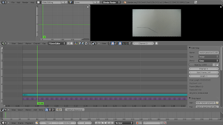
I have been using Blender to make the movie clip - it is such an amazing all round piece of software!
Wednesday, August 17, 2011
Final
Completed my Final Model
I came to the conclusion that I did need to involve the contributors more than I had planned. And following research and discussions I came to the idea that my form needed to change as people altered it how they wanted: just like open source software. So in my final model The ceiling or mesh is held up by beams which can fold and bend as the public move through it, which in effect alters the form of the roof and structure. The model did not work as well as I had hoped: the laser cutters only cut the thicker mesh I gave them for some reason ( and did it twice... not sure what happened there ) so my ceiling is rather rigid. However, we can see the principles even if in effect it does not work as well as I had hoped.


Further research
I used resources gathered from the Architecture Library. I photocopied some of the reference work but I am unsure as to whether I am able to put them online ( I dont think that is allowable under copyright law ). However, the books are as follows:
- Exuberance: New Virtuousity in Contemporary Architecture, Architectural Design Magazine, March April 2010 Wiley
- 4dspace: Interactive Architecture, Wiley
- Evan Douglas Autogenic Structures
These books had some incredible images and concepts in them. Perhaps the most relevant to mine was the idea of an inelligent room "Ada". This room tracks is visitors and has interactive floors that light up which can also play games with, and respond completely to, its visitors. Perhaps this could be a potential for my concept? As visitors walk in or through having their trail recorded and displayed both above them on the ceiling and projected onto the floor from beneath. This would provide a level of interactivity within the form and space of the building - a certain resonsiveness. However, I do not feel this is altering the form itself. Rather than projecting or applying 'digital make-up' to provide a false sense of alteration wouldnt it be more impressive, and better related to open source software ideals, if the actual form and shape of the building actually changed with its visitors? Just as open source software has at its heart the shifting of shape from contributors, this space must have its shifting shape contributed to by the public.
Research
So I went and did some further research to gather ideas and inspiration. The following is a list of resources that I found inspiring or useful in some way.
Smart materials:
http://iaac-digitalarchitecture.blogspot.com/2007/11/interactive-buildingsexploration-of.html
Arduino – interactive technology design ( open source )
http://seedmagazine.com/slideshow/interactive_architecture/
Fabriacet Conference
Company with products related to my ideas:
Interactive Architecture:
http://www.interactivearchitecture.org/
I-wall and I-floor
http://www.enoshmink.com/viewproduct.php?proid=44
LED lighting
http://www.superlight.co.nz/FWS/modules/estore/public/fes_catalog.php?id=1
Tutorial for Hexagon Lattice in Illustrator:
http://forums.adobe.com/message/3603810
Tuesday, August 16, 2011
Critique

The recent critique brought a few points to my attention:
- Model concept correlation to Open Source Movement was too weak
- Need to develop a model with improved attention to scale
- LAttice is integral but is not strong enough to be focus of model unless developed further than a simple pattern representing people
Because of this I developed a further paper model. This allowed me to mould and shape it - which would be due to the contributions and presence of individuals - being able to change the very form of the architecture in which they are in. This is an idea that communicates how open source software is able to be altered and changed by the very individuals who use it.
Critique Model
With critiques approaching I created a basic tangible model created using paper and a printed grid to communicate the ideas I created in blender ( see previous post ). I began playing with using a larger 'grid' to create my form and these spaces of interactivity and verbal discourse or exchange with the particpants.
Laser Cutting Mockups ( digital )
I further examined this concept of form and possibility through digital manipulation of the latticed array. The following are some various forms I created usihng blender.
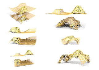 The main idea of these forms is having a lattice of interconnected peices that join to make the whole. Originally my idea was to have each of these individual entities be suggestive of the individuals contribution within open source software, and how each contributes to the overall idea. They came together to create the form of the booth.
 The main idea of these forms is having a lattice of interconnected peices that join to make the whole. Originally my idea was to have each of these individual entities be suggestive of the individuals contribution within open source software, and how each contributes to the overall idea. They came together to create the form of the booth.
The following were some of the ideas/forms I preferred:
The first form has an a-symmetrical grounding on oly one side, giving an unbalanced constructed feel consistent with the theme of software: an artificial construct.
However, the overarching was more practical as a site in construction. The bottom form applied the possibility of two levels in a rudimentary and early proposition which was quite accidental hence there is no access route.
From these form constructions the lattice proves to be significant in being a modular base for the design, although I feel the theme of each one representing an individual is not qualified as a satisfactory conclusion. The abstraction and metaphysical relation to open source software needs a stronger foundation.
Sunday, August 7, 2011
Beginning Laser Cutting
Our group has begun working on our laser cutting projects. As a result I have started thinking about some preliminary concepts and themes. So I have chosen to look at open source software and idea exchange as the hub of my 'market stall' which was our brief.
Because Sustenance is the theme for these two weeks I thought of what my day consists of and perhaps what I spend a lot of time doing. Because computers are a large part of the majority of what I do I feel that this is a primary component of the sustenance of our modern day living - although it is not a sustainable practice. However, looking into possibilities of sustainable technology I felt that open source software is a step in the right direction towards an interlinked and sustainable digital future.
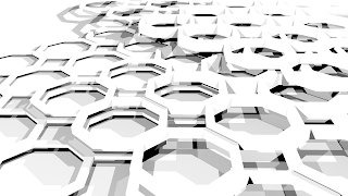
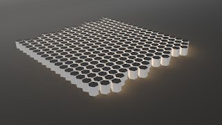
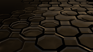
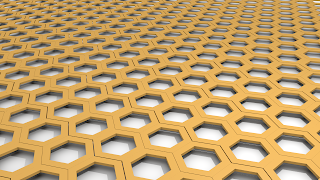
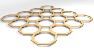
Because of the interconnecting, modular web connotations of open source development I've started thinking of having a sort of 'weby' pattern of hexagons for my basic motif, and interlinking and moulding it to be the shapes that I need. Perhaps the next move is to experiment with further sizes and interconnecting these to produce functional variation. I still have not considered the need for interlinking and constructive (dis)assemblage. That will be fun though!!
I am also following tutorials and learning how to use blender gradually.
I created all the following images in Blender:
Wednesday, August 3, 2011
Matrix
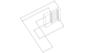
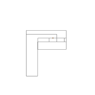
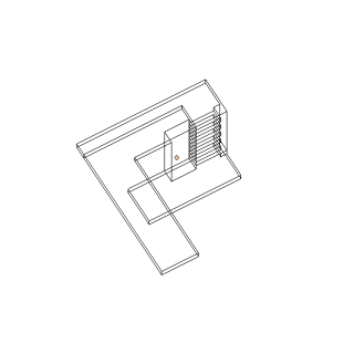
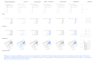
So we got this matrix assignment today, due in tomorrow. Took AGES to do. Its 2:30 am and Im still not finished. Anywho: I was lucky because I had been working on a digital model, so I was able to use some of the renders from that for my matrix, however, it is all of an earlier version of my project, and so my final concrete 1:1 model is not the same as the plans on the matrix. However, here are some of the files from that.
Subscribe to:
Comments (Atom)


